The Art of Minimalist Layouts
Minimalism is not the absence of design; it is the absolute precision of it. When engineering modern interfaces, the layout must follow natural reading hierarchies. Rather than loading user grids with complex animations, we focus on subtle micro-animations that feel responsive and alive.
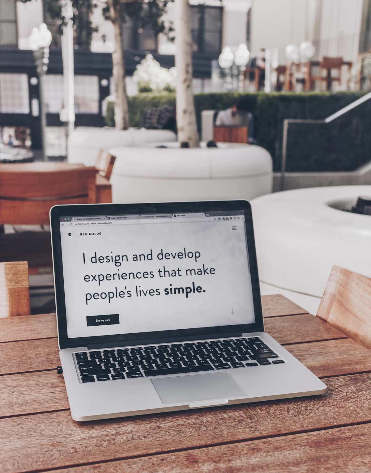
1. The Power of Typography
Typography is the layout foundation. By utilizing modern sans-serif fonts (like Outfit or Inter) with tight character tracking, layouts gain premium editorial weight. Large header text (using tracking-tighter) establishes hierarchy instantly, leading the reader's eye down the page naturally.
"Simplicity is the ultimate sophistication." — Leonardo da Vinci. It defines how we design systems.
2. Frosted Glass and Ambient Lights
Modern layouts use visual depth to guide interactions. By overlaying translucent glass layers (using backdrop blur classes) on top of soft, blurred background radial gradients, we create tactile workspaces that feel elegant and modern. Contrast remains clear, and layout elements feel premium.
Performance is Design
A beautiful design that loads slowly is a design failure. We treat page compilation budgets as a core aesthetic value. Lightweight script loads, optimized SVG elements, and CSS cleanups guarantee rendering speeds inside the sub-second range. Visual excellence must work in hand with technical performance.